

Artistic Wall Decor for Living Rooms: 7 Fresh Ideas
Table of Contents
- Why Your Living Room Needs Artistic Wall Decor, Not Just Filler
- 1. Start With a Statement: Large-Scale Canvas Prints
- 2. Create a Curated Gallery Wall Arrangement
- 3. Bring the Outdoors In With Biophilic and Nature-Inspired Art
- 4. Where to Find Unique Animal Wall Art Online
- 5. How to Arrange Wall Art in Your Living Room
- 6. Match Art to Your Color Palette and Interior Design Style
- 7. Care, Framing, and Making Your Art Last
- Frequently Asked Questions
Last Updated: September 6, 2026
Artistic wall decor for living rooms sets the emotional tone for how a room feels every time you walk in. A blank wall is a missed opportunity to express personality, yet most living rooms end up with generic filler. This guide from Eric & Eloise Collection walks you through seven fresh approaches to choosing and arranging pieces, from large-scale canvas prints to sculptural animal mounts, so your walls reflect who you actually are.
TL;DR:
- Start with one statement piece, then build around it rather than buying matching sets
- A curated gallery wall beats a grid of identical frames every time
- Nature-inspired art adds warmth without clashing with existing decor
- Hang art at eye level (57 inches to center) for a polished, professional look
- Match art to your color palette, not the other way around
- Invest in quality framing and materials so pieces last for decades
Why Your Living Room Needs Artistic Wall Decor, Not Just Filler
The biggest mistake homeowners make is treating wall decor as an afterthought. Artistic wall decor for living rooms should be a deliberate choice, because the visual weight of a room's walls directly influences how spacious, calm, or energetic the space feels. When you choose pieces with intention, you create a focal point that anchors the entire room.
Think of your wall as the largest canvas in the room. A well-chosen piece of art adds vertical interest, breaks up large expanses of color, and gives the eye a place to rest. According to the American Psychological Association's research on environmental psychology, visual environments affect mood and stress levels, which means the art you live with has a measurable impact on how you feel at home.
1. Start With a Statement: Large-Scale Canvas Prints
Large-scale canvas prints are the fastest way to make a living room feel designed rather than decorated. A single oversized piece, roughly two-thirds the width of your sofa, instantly becomes the room's focal point and eliminates the need to fill every inch of wall with smaller items. This works particularly well above a sofa or fireplace, where the eye naturally lands first.
When choosing a large canvas, consider whether you want the art to blend with your existing color palette or stand out as a deliberate contrast. Abstract paintings in earthy tones work well in minimalist and biophilic spaces, while bold, colorful pieces suit maximalist and dopamine decor styles.
2. Create a Curated Gallery Wall Arrangement
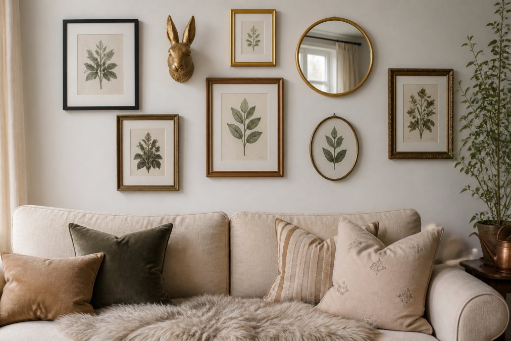
A gallery wall is the most flexible way to display artistic wall decor for living rooms because it allows you to mix styles, textures, and frame types in one cohesive composition. Unlike a single large canvas, a gallery wall can grow with you. The key is curation: choose pieces that share a common thread, whether that is a color story, a theme, or a mix of framed art and sculptural objects.
The Three Anchor Layouts That Always Work
Most professional designers rely on three structural templates when arranging a gallery wall. The grid spaces identically sized frames evenly in rows and columns, reading as orderly and intentional. The salon-style cluster packs frames of varying sizes tightly together, typically with 1.5 to 2 inches between them, suiting maximalist and eclectic rooms. The central anchor places one large piece, often a sculptural animal mount or oversized canvas, flanked by smaller pieces radiating outward in an organic, asymmetrical pattern, making it the most forgiving layout for mixing dimensional objects with flat frames.
The Visual-Weight Rule for Mixing Objects and Frames
When you combine framed prints with dimensional objects like a bronzed animal mount, you are balancing visual weight, not physical weight. A dark, heavily textured piece draws the eye more than a thin white frame. Place the heaviest visual element slightly off-center, then balance it with two or three lighter pieces on the opposite side. A storybook-style fox mount in an antique gold finish carries significant visual mass; pairing it with a single small print will feel lopsided, so cluster two or three smaller frames on the opposing side.
The Paper Template Method, Step by Step
Before driving a single nail, cut kraft paper to the exact dimensions of every frame and object you plan to hang. Tape these templates to the wall and step back 8 to 10 feet to assess the arrangement. For salon-style clusters, keep gaps tight and consistent at 2 inches; for central-anchor layouts, allow 3 to 4 inches of breathing room between the anchor piece and its satellites. Once positioned, mark the top center of each template and transfer that mark to the back of the actual frame. This method prevents the most common gallery wall failure: a composition that looked fine on the floor but drifts apart on the wall.
The 8-Foot Rule for Scale
A gallery wall fails when it is too small for the wall it occupies. The entire arrangement should cover roughly 60 to 75 percent of the available wall space above a sofa or console. If your wall is 8 feet wide and your sofa is 6 feet wide, the gallery wall should span roughly 4 to 4.5 feet. For rooms with 9-foot ceilings, extend the arrangement vertically to within 6 inches of the crown molding to draw the eye upward.
The "Odd Numbers" Myth, Debunked
The oft-repeated advice to use odd numbers of pieces is a simplification. What actually matters is visual balance, not arithmetic. A well-balanced pair of large landscape prints flanking a central mirror can look perfect, while an unbalanced trio of mismatched frames can feel chaotic. Focus on distributing visual weight evenly and let the layout dictate the count.
3. Bring the Outdoors In With Biophilic and Nature-Inspired Art
Biophilic design, which connects interior spaces with nature, has moved from trend to staple. Nature-inspired wall decor, from botanical prints to animal wall art, taps into this desire for calm and connection. Organic forms and earthy tones soothe the eye in a way that stark geometric patterns often do not.
For living rooms, consider pieces that feature animals, landscapes, or botanical subjects rendered in a way that complements your existing style. A storybook-style animal mount in a bronzed finish brings the charm of the natural world indoors without the literal weight of taxidermy. These sculptural works read as both art and conversation piece, pairing beautifully with neutral walls and natural materials like linen, wood, and stone.
4. Where to Find Unique Animal Wall Art Online
If you are looking for unique animal wall art online, the challenge is not finding options; it is filtering out mass-produced pieces that lack character. Many big-box retailers sell identical, factory-made animal heads. The pieces worth investing in come from artists and small collections that offer original designs and quality materials.
When shopping online, look for details that signal craftsmanship: hand-finished surfaces, quality casting materials, and a clear artistic point of view. Pieces designed by a named artist and produced in limited runs hold their value and visual appeal far better than generic imports. A well-made animal wall mount becomes a heirloom-quality piece you will not want to replace when trends shift.
Why Storybook Characters and Bronzed Finishes Stand Out
The most memorable animal wall art tells a story. Rather than a realistic replica of a deer or fox head, consider pieces with character and personality, figures that seem to have stepped out of a children's book illustration. This is where the Eric & Eloise Collection excels: artist Jessica Hiemstra has designed nine original storybook characters, each cast in aluminum with antique gold and bronzed finishes. The result is wall decor that feels personal and enchanted, not mass-produced.
A bronzed finish offers a practical benefit beyond aesthetics: it is durable, resistant to tarnishing, and complements many interior design styles. Bronze and antique gold tones work in modern minimalist spaces as a warm accent and fit seamlessly into maximalist and eclectic rooms.
5. How to Arrange Wall Art in Your Living Room
Knowing how to arrange wall art in living room spaces correctly separates a professional-looking display from one that feels slightly off. The most common mistake is hanging pieces too high, which makes the art feel disconnected from the furniture below it.
The 57-Inch Rule and Other Sizing Guidelines
The 57-inch rule states that the center of your artwork should hang 57 inches from the floor, placing it at average eye level. This works for gallery walls as well as single pieces: treat the entire arrangement as one unit and center it at 57 inches. For art above a sofa or console, leave 6 to 8 inches of breathing room between the furniture and the bottom of the frame.
For a gallery wall, map out the arrangement on paper first or use kraft paper cut to the size of each frame, taped to the wall. This allows you to adjust spacing without making extra holes. Keep gaps between frames consistent, typically 2 to 3 inches, so the arrangement reads as one cohesive composition.
Arranging Art Above a Sofa or Console
Above a sofa, the art should span roughly two-thirds of the sofa's length to feel balanced. If you are hanging a single large piece, center it over the sofa. If you are creating a grouping, treat the outer edges of the arrangement as the boundaries and center those over the furniture. Above a console table, the same two-thirds rule applies to the width of the table below.
6. Match Art to Your Color Palette and Interior Design Style
The relationship between art and your room's color palette matters more than most people realize. The right piece can pull a room together, while the wrong one can make even a well-furnished space feel disjointed. The goal is not to match art exactly to your wall color, but to create a conversation between the two.
The Psychology of Color in Living Room Art
The colors in your wall art are actively shaping your nervous system every time you enter the room. Cool hues, specifically blues in the 480 to 500 nanometer wavelength range, have been shown to lower heart rate and promote relaxation (PubMed). Warm hues like reds and oranges stimulate the sympathetic nervous system, increasing alertness and energy. If your living room is where you unwind after work, a large abstract piece saturated in crimson and tangerine will work against that goal. If the same room hosts dinner parties, those warm tones will support the energy you want.
The 60-30-10 Rule Applied to Art
Interior designers commonly use the 60-30-10 rule for color distribution: 60 percent dominant color (walls and large furniture), 30 percent secondary color (upholstery, rugs, curtains), and 10 percent accent color. Your wall art should function as part of that 10 percent accent layer, not as a wildcard introducing a fourth competing hue. If your throw pillows are deep forest green, choose art that contains that same green in at least one visible area, creating a visual echo that feels coordinated without being matchy-matchy.
The Undertone Trap: Why "Neutral" Art Clashes
A common failure is buying art that appears neutral in the store but clashes once hung. The culprit is undertones. Cream walls often have a yellow or pink undertone, while greige walls lean warm or cool depending on the pigment ratio. A black-and-white abstract print with cool blue-gray undertones can look jarring against a warm, yellow-beige wall. Before committing, hold the piece against your wall for 24 hours and observe it in morning, afternoon, and evening light.
Color Pairing Cheat Sheets for Common Living Room Palettes
For warm neutral walls (beige, tan, cream), choose art with earthy terracotta, olive, or rust accents. For cool neutral walls (gray, greige, off-white with blue undertones), select art with slate blue, sage, or charcoal elements. For white walls, you have the most freedom, but the art becomes the room's primary color source, so choose deliberately: a single large canvas with a bold cobalt or emerald focal color will define the entire space. For dark walls (navy, charcoal, forest green), pale art with high contrast, cream backgrounds, gold leaf, or bright white frames, prevents the room from feeling like a cave.
Dopamine Decor and the Saturation Sweet Spot
The dopamine decor trend, which gained traction in 2024 and remains strong, encourages vibrant, joyful colors in living spaces. But there is a measurable difference between saturated and overwhelming. A useful benchmark is the HSV color model: hues with saturation values between 60 and 80 percent and brightness between 70 and 90 percent read as energetic but sophisticated. Saturation above 90 percent across a large canvas can trigger visual fatigue within minutes. If you want the dopamine effect without the headache, choose art that uses high saturation in small areas, a bold yellow sun in an otherwise muted landscape, rather than wall-to-wall neon.
The Lighting Variable Most Articles Ignore
Color perception changes dramatically under different light sources. Incandescent bulbs cast a warm yellow light that deepens reds and oranges while dulling blues. LED bulbs labeled "daylight" (5000K to 6500K) render colors more accurately but can make warm-toned art feel washed out. Before finalizing a piece, view it under the exact lighting you use in that room. If you rely on warm dimmable LEDs in the evening, a cool-toned abstract will look gray and lifeless after sunset. If you have large windows with southern exposure, UV-filtering window film is worth the investment to prevent fading.
7. Care, Framing, and Making Your Art Last
Quality wall decor is an investment, and protecting it requires knowledge about materials and maintenance. Canvas prints and framed art should be kept out of direct sunlight, which can fade pigments over time. For sculptural pieces like animal wall mounts, dust regularly with a soft, dry cloth and avoid harsh chemical cleaners that can damage the finish.
Framing is where many people cut corners, and it shows. For inexpensive prints, a ready-made frame from a big-box store is fine. For valuable or sentimental pieces, professional framing is worth the cost: archival materials, proper matting, and UV-protective glass will preserve the art for decades. According to the Smithsonian's guidelines on art preservation, proper framing and environmental control are the most effective ways to extend the life of artwork in a home setting.
Choosing artistic wall decor for living rooms does not have to be a compromise between style and substance. The best approach is to start with pieces that genuinely speak to you, arrange them with intention, and invest in quality that will hold up over time. At Eric & Eloise Collection, we believe wall decor should bring personality and storybook charm into your home, which is why our collection features original characters designed by artist Jessica Hiemstra, cast in durable bronzed aluminum. Whether you are drawn to a sculptural animal mount for your mantel or a statement piece for a modern gallery wall, our collection offers a distinctive way to transform your space. Subscribe to our emails to be the first to know about new characters and design inspiration for your living space.
Frequently Asked Questions
What are some creative wall art ideas for my living room?
Move beyond a single framed print. Build a gallery wall that mixes mediums: canvas prints, framed sketches, and sculptural pieces like animal wall mounts. For a curated look, pick a unifying theme, such as nature or a storybook aesthetic, and repeat a finish, like antique gold or bronzed aluminum, to tie the pieces together. Add visual depth by combining flat art with 3D objects.
How do I choose the right size wall art for my living room?
Size your art to the wall and the furniture below it. A piece above a sofa should span roughly two-thirds of the sofa's width. For a large, empty wall, one oversized piece or a well-planned gallery wall works better than several small, scattered frames. A common guideline is to hang art so the center sits at eye level, about 57 inches from the floor.
What is the best way to arrange wall decor above a sofa?
Treat the art as one unit. If using multiple pieces, keep the outer edges of the arrangement roughly aligned with the sofa's armrests, and leave 6 to 10 inches between the top of the back cushions and the bottom of the frames. Lay the arrangement out on the floor first to perfect the spacing, then transfer it to the wall.
What are the current trends in artistic wall decor for 2026?
The biggest shift is away from generic mass-produced prints and toward pieces with a story. Buyers are drawn to unique animal wall art online, and to sculptural items that add texture and shadows. Biophilic themes remain strong, while maximalist styling encourages mixing eclectic pieces with earthy tones and antique finishes for a collected-over-time look.
Will bronzed aluminum wall art hold up over time?
Yes. Aluminum is lightweight and resists rust, making it a practical choice for indoor wall decor. The bronzed and antique gold finishes are applied to last, so the piece should not tarnish under normal household conditions. To keep it looking its best, dust it occasionally with a soft, dry cloth and avoid harsh chemical cleaners.